
Andrew Coyle, a product design lead. Today’s blog, I will jot down some of them down to help make your forms more practical.
Forms are a very important part of digital product design and it’s crucial to have them as user-friendly as possible. The tiniest change can make a big difference when filling out a form. Of course that isn’t to say that everything you read in this article is hands down the be all and end all, no. There are times when you will opt for a different design to serve a specific purpose or you may find one option more appropriate than the other, but here are some design techniques proved to have worked better than others:
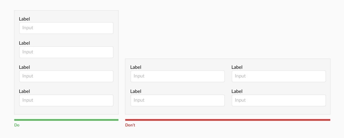
As you can see in the first image, filling out a form that is in one column instead of two is a lot less complicated and more practical.
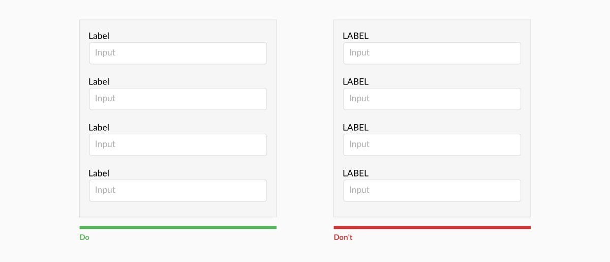
Using capital letters to label your boxes makes it more difficult to read and scan.
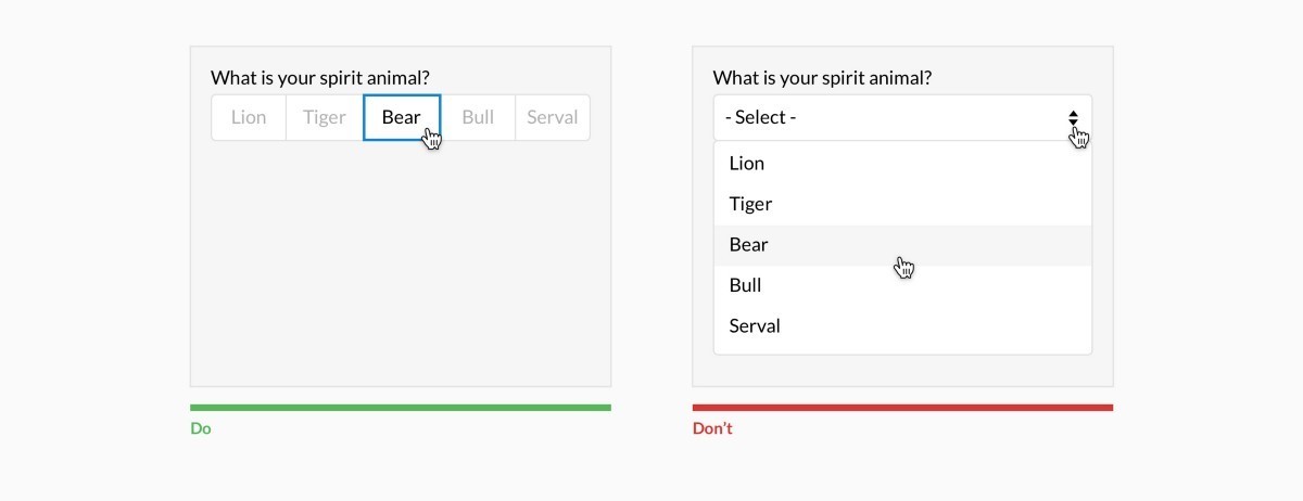
If you have less than 6 options, there is no need to hid them all in a drop down menu, instead have them all shown next to each other. This makes it easier for the reader to select and option.
If you want to design your website forms, landing page forms or any other generating leads form, start your journey via contacting us
.png)