After reading Laura Elizabeth’s fantastic blog, A Simple Web Developer’s Guide To Color
I thought I would sum up some of her ideas along with mine to help users and web designers discover the perfect coloures for their project!
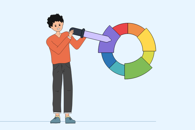
Selecting the right coloures may not seem like the easiest thing in the world especially when you’re only just starting out. You’ll need a crisp colour combination that will best compliment your client’s brand while keeping things nice and simple, sounds frustrating right? But let me tell you a secret, it’s actually pretty easy!
Yes, choosing the right shades isn’t that hard at all. In fact, it can be both fun and informative, how?
Let me ask you a question, when you picture a website, depending on its “genre”, about how many coloures do you visualize? I’m going to toss a random guess and say 4, (although you probably only pictured 2 haha) so let’s say you want your project to have around 4 coloures. Well the great thing is, you can get all the right coloures you want and need, through figuring out two things:
1.Your base colour
2.Your accent colour
Let’s talk a little bit about what each one is before diving into the details:
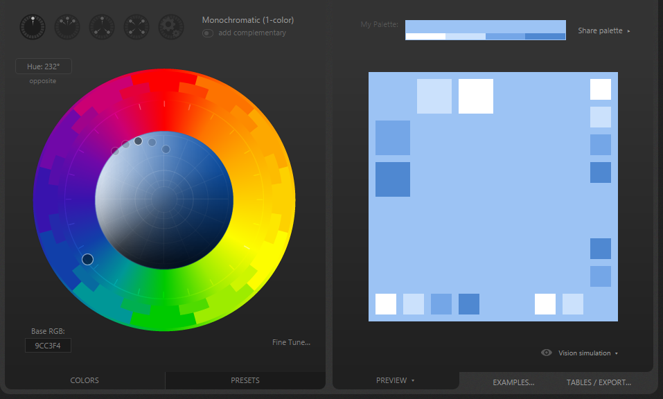
Your base colour is your main colour, the colour that’s going to appear the most in your project. So choosing a base colour must be precise and accurate as you will be focusing all your work on it. And guess what? The thing about the base colour is, you’ll know it when you see it!
Your accent colour works like an “assistant” to your base colour. It should stand out on your website and should therefore contrast with your base colour. You’ll only be using your accent colour for certain elements on your website, such as your call to action buttons or simply small parts of an image.
Moving onto the first step in the colour hunting process: discovering your base and accents coloures!
Let’s start by finding your base colour.
Did you know? The naked eye is capable of seeing 10 million shades of different coloures simultaneously, (imagine that!). But what you probably don’t know is there are an infinite number of coloures in the world, this is because if you gaze upon a landscape, you’ll realise the coloures are ever-changing according to the measure of sunlight cast upon each one during each hour of the day, “so if we have 10-million colors, times 10- million lighting types, times 10-million lighting levels, times 10-million surrounding colors, times 6-billion people in the world, times 3 modes of viewing we get a really huge number. The result of that multiplication is 18 followed by 33 zeros (18,000,000,000,000,000,000,000,000,000,000,000), or 18 decillion!!!”
So it’s safe to say that the number of coloures never end.
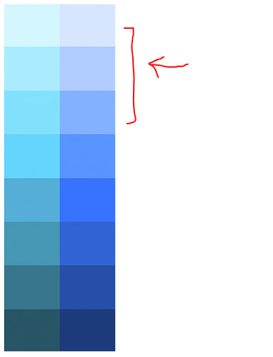
So keep all these coloures in mind as you can use them nicely in your project if you are looking to implement more than two coloures.
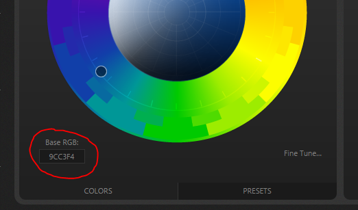
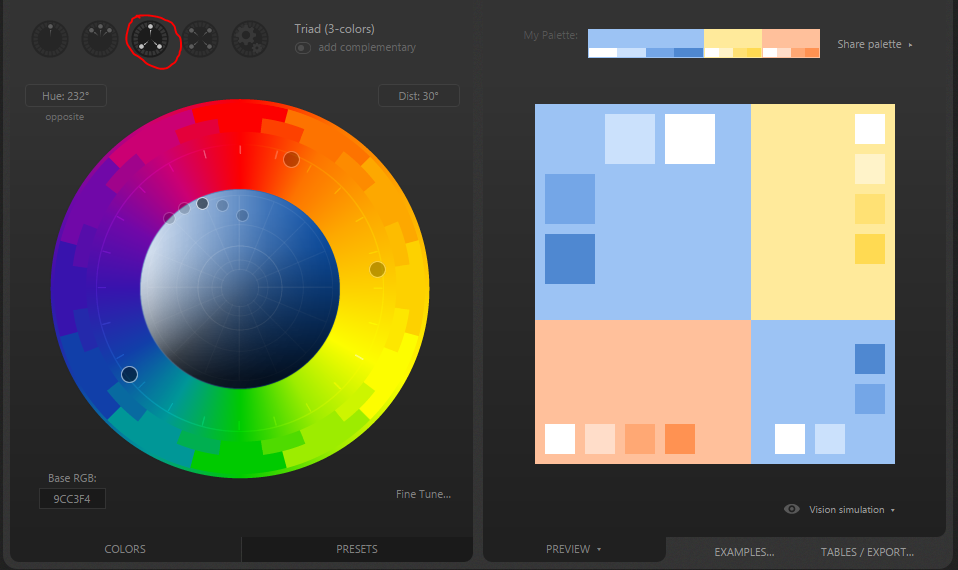
Our next step is our accent colour, to find your accent colour on Paletton, simply click on the “add complimentary” button and the screen will display something like this:
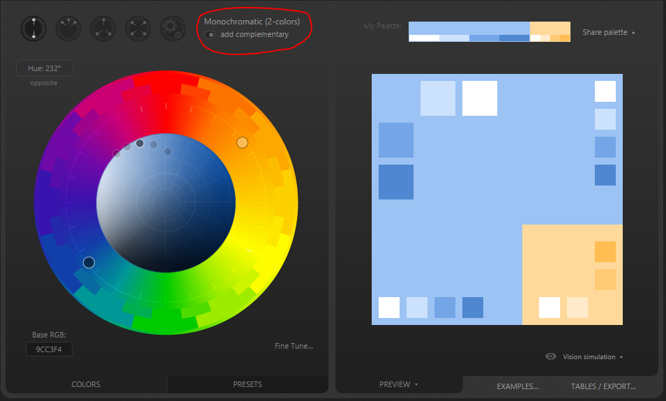
Paletton has picked a sort of pale yellow-orange for my accent colour. Of course you do not have to go with the colour paletton chooses for you, if you want a different accent colour, simply click on the images listed beside the “add complimentary” button and see your choices and other coloures that go well with your base!
There you have your base colour, your accent colour and a perfect combo of other coloures you can use! But keep in mind that less is more. Limit the coloures in your website to make it stand out with its simplicity. In my baby website, I would use baby blue, the accent colour, and maybe add a dash of white, and the two shades of blue, as they coordinate nicely with each other and add to that “baby style” I’m looking to for!
Now all that’s left is picking the font colour.
Now for the font colour, Grey is best as it isn’t too harsh on the page like black. So going for a dark shade of grey for the font will add a softer touch, you might also opt for a white in some parts such as the highlight, of course choosing coloures from your new pallet will compliment your pages nicely according to your design, but grey is a colour that you just can’t beat!
.png)