

Earlier, I wrote an article on how to pick the right colour for your website .Today I will explain in detail how your choice of coloures will affect your website.
Every colour has its own message, its own meaning and its own effect on your project, and depending on how wisely you deploy each one, you will be gifted with a visually attractive and well-managed website that will speak for itself!
Selecting coloures that clash with the message you are hoping to convey, will have a damaged outcome.
Coloures must be properly studied and carefully observed before implementation, and selecting the wrong one can ruin everything. Why?
Unfortunately, most people only realise their mistake after they have taken a long shot with their website, and solving that mistake may require the changing of everything such as the logo, the company character, sometimes even the business card. Can you imagine all the modification they have to go through and all the risks they are obliged to take just to correct the colour?
That’s why it’s best to spare yourself the trouble and pick a great colour that flatters your brand right from the very beginning!
In this blog, We will provide a simple and basic colour study to help you along the way of colour picking, so stay tuned!
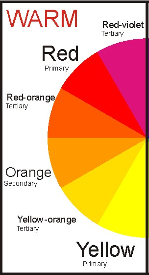
Warm coloures are those coloures you think of when you hear the word “summer”, such as red, orange, yellow, the colour of autumn leaves or the sun at sunset. These coloures symbolize passion, energy, happiness and excitement.
Red is associated with power. It symbolizes danger, strength, anger, love and war, depending on how and where you use it. Using red as an accent colour can signify leadership and the ability to perform quick decisions. The colour red has many cultural meanings depending on country. For example, in china, red symbolizes relaxation and happiness unlike in Africa where it is the colour of danger, warning and is also used to represent a lot of life- threatening diseases such as AIDS.
Shades of red:
Light red: stands for love, passion and happiness.
Pink: friendship, love and femininity
Maroon (dark red): Danger, rage, leadership, strength, courage and wrath.
Yellow is the colour of summer, the sun. It brings together a combination of happiness, energy, honour and loyalty. However, it can also be a
disturbing colour, many warning signs carry a combination of yellow and black. A study also revealed that infants cry more when placed in a yellow
bedroom as it activated the anxiety centre of the brain ``Never paint a nursery yellow, in infants, it results in crying. In adults, it results in shortness
of temper. We notice a lot of fighting. `` said Carlton Wagner, director of Wagner Institute for Color Research, in Santa Barbara, Calif.
Yellow can also represent cowardliness and treachery, but at the same time hope and optimism. As you can see, it is one confusing colour!
However, it all comes down to how and where you use it, even the shade plays a role. Yellow is great when branding children’s clothing, however
avoid it completely when using it to sell expensive items to men as they see it as a “childish colour”.
In India, yellow is the colour of merchants and in Japan the colour of courage.
Shades of yellow:
Dark yellow: Jealousy, illness and caution.
Light yellow: Cheerfulness and intellect
Orange is a colour that breathes life into the most silent of images. It is the outcome of mixing yellow and red together and so it combines the joy and happiness that comes with both.
Being an attractive colour to the human eye, orange represents enthusiasm, determination, success and encouragement, which is why teachers are advised to use that colour when writing on the whiteboard.
Orange is a colour used less frequently that red in websites.
Shades of orange:
Dark orange: Treachery and mistrust
Gold: Wisdom, wealth and quality
Red-orange: Pleasure, aggression and desire

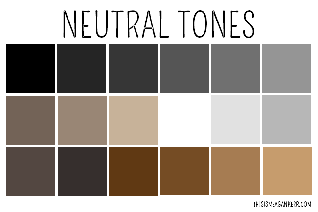
In web design, neutral coloures are mostly used as secondary or background coloures, they look great coupled with cheerful and bright coloures, to name a few:
Black represents evil, death, strength, elegance and mystery. It is also associated with power and can mean mourning in some countries. It is the strongest of neutral coloures.
In web design, black is used to make other coloures stand out as it is the darkest colour and comes in contrast with any shade.
White is the absolute opposite of black, and hence, carries similar characteristics, such as contrast and elegance.
White represents purity and virtue which is why it the colour of wedding dresses. White is also the colour of health which is why doctors and nurses wear white, hospitals in general are mostly white as it gives a fresh and healthy glow.
Although the colour white is associated with all the aforementioned characteristics, it is still the colour less frequently used in websites.
Grey is a combination of both black and white, and so it can replace both. A light shade of grey can be used instead of white and darker shades instead of black. Grey can represent gloom and sadness as it is associated with cold, miserable winters.
Brown is somewhat classified as a warm colour, being a mixture of red and yellow which are both warm coloures. Brown is linked to wood, Earth and stone -nature in general. It is mostly used as a background colour, and can be very flattering if used correctly. It brings forth the feeling of warmth and can sometimes replace black.
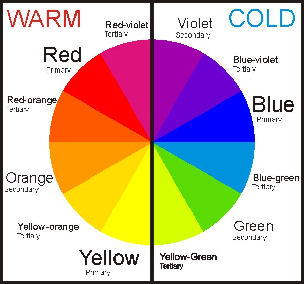
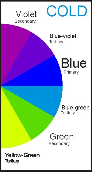
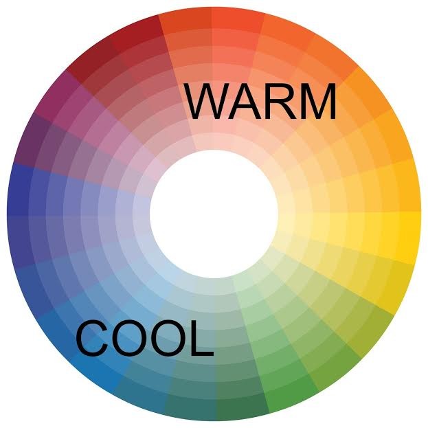
In a nutshell, studying coloures correctly and implementing them best to fit and flatter your brand can be an entertaining experience! Here’s a quick view of the colour wheel chart so you can see all warm and cool tones together:
YOU look forward to a choice of colors for your website OR even websites design …
Great!
VOILA will help you, just send us an email and we’ll be in touch!